
Table of Contents
The average Australian spends over 5.5 hours on their phone daily. It is definitely something every person should be worried about but also, what does this mean for business? Well, most of your potential customers aren’t sitting at a desk when they Google your business – they’re scrolling on their phones, often while on the go. Whether they’re looking for a plumber in Marrickville, an emergency dentist in Cronulla, or a web design agency in Sydney, more often than not, that first impression happens on a mobile screen.
For Sydney businesses, this shift has real consequences. Google now operates with 100% mobile-first indexing, which means that your mobile site is your website in the eyes of search engines. As Google states, “Google uses the mobile version of a site’s content, crawled with the smartphone agent, for indexing and ranking.” In other words, what Google sees and measures on mobile determines your visibility everywhere – including desktop searches.
This change is both technical and behavioural. More than 80% of local service searches in Australia now happen on mobile devices. If a mobile page takes longer than three seconds to load, users abandon it almost instantly. For a Sydney tradie, practitioner or consultant, that’s a lost lead before the page even finishes loading.
Mobile SEO in Sydney isn’t optional anymore. Google ranks and indexes the mobile version of your site first and customers decide within seconds whether to stay or swipe away.
For businesses that rely on being found quickly, think plumbers, dentists, auto repair shops, legal consultants, beauty salons and the like, mobile SEO is now as vital as having a phone number or ABN. The goal isn’t just about ranking higher; it’s about delivering a seamless experience for the mobile-first customer: fast, readable and easy to act on.
So, how does Google’s mobile-first indexing actually work? And what can Sydney businesses do to stay visible and competitive.
What Is Mobile SEO and Why Does It Matter in 2025
Mobile SEO is the practice of optimising your website for search and usability on smartphones and tablets. It ensures that your pages load quickly, text is legible without zooming, buttons are easy to tap and the design adjusts naturally to smaller screens.
According to Google Search Central, a mobile-friendly site is one that “serves the same HTML code on the same URL regardless of the user’s device but can display the content differently based on screen size.” This approach, known as responsive design, is now Google’s official recommendation for all modern websites.
Why does this matter so much in 2025? Because Australians increasingly depend on their phones to find, compare and contact local businesses. Studies show that more than half of all web traffic globally now comes from mobile and locally 2 3, many Sydney-based industries, like hospitality, home services and wellness, see over 70% of enquiries from mobile devices.
When your website isn’t mobile-friendly, several things happen at once:
- Your rankings drop. Google’s mobile-first crawler sees an incomplete or poorly formatted site.
- Your visitors bounce. People abandon pages that take too long to load or don’t display properly.
- Your conversions fall. Even if users find you, they won’t tap “Call now” if the button’s too small or hidden.
In practical terms, if your mobile site is slow or cluttered, you’re losing mobile visitors and also visibility across ALL devices.
For Sydney businesses, poor mobile SEO means losing both visibility and credibility. A fast, clean mobile site keeps you in Google’s results and in your customer’s shortlist.
Google itself makes the stakes clear: “While it’s not required to have a mobile version of your pages to be included in Google Search results, it is very strongly recommended.” Without a high-performing mobile experience, your pages can be partially or completely excluded from search results once mobile-first indexing applies.
How Does Google’s Mobile-First Indexing Work?
When Google first announced mobile-first indexing in 2016, it signalled a major shift in how the web would be ranked. By October 2023, the transition was complete – every site indexed by Google is now evaluated through a mobile lens first.
So, what does this mean for your Sydney business website? It means Googlebot now uses its smartphone crawler to inspect your pages. According to Google Search Central, “Make sure that Google can access and render your mobile page content and resources.” That includes text, images, videos, JavaScript and CSS files. If any of these are blocked or missing, Google may fail to index your content correctly.
The mobile-first process works like this:
- Google’s crawler visits the mobile version of your site.
- It analyses the HTML, structured data, metadata and content.
- It indexes those pages as the canonical source of truth for your website.
- Your rankings across both desktop and mobile searches are then based on that version.
That’s why Google emphasises: “Make sure that your mobile site contains the same content as your desktop site.” If your mobile pages omit key sections, images, or structured data, Google won’t consider your desktop version as a fallback – it simply won’t see that missing content.
For Sydney business owners, this means consistency is non-negotiable. Your mobile site should mirror your desktop experience – not in layout, but in substance. Use the same titles, meta descriptions, alt text and structured data across both.
For example, a local sparky’s site might have a desktop page featuring detailed service descriptions and customer reviews. If the mobile version trims that down to a brief summary, Google will rank it based on the reduced content, leading to weaker performance overall.
In Google’s eyes, your mobile site is now the primary version of your business online. If it’s missing content or structure, your rankings will take a hit.
Choosing the Right Mobile Configuration
Before you even touch design tweaks or speed tools, your website’s mobile configuration determines how users and Google experience it. There are three main setups you can use: responsive design, dynamic serving and separate URLs. Each one delivers the same goal, mobile usability, but in very different ways.
Responsive Design (Google’s Preferred Setup)
According to Google Search Central, “Responsive design serves the same HTML code on the same URL regardless of the user’s device but can display the content differently based on the screen size.”
This single-URL structure means your site automatically adapts to the device. Whether someone visits from a phone, tablet, or desktop, they see the same content styled appropriately through CSS.
That consistency is what makes responsive design the gold standard. Google adds, “Google recommends Responsive Web Design because it’s the easiest design pattern to implement and maintain.”
For Sydney businesses, this approach simplifies everything:
- No redirects between mobile and desktop versions.
- No duplicate content or conflicting SEO signals.
- Easier maintenance, since updates only happen once.
Responsive websites also support faster load times and better user sharing – if a customer sends a link via SMS or social media, it’ll work perfectly across devices.
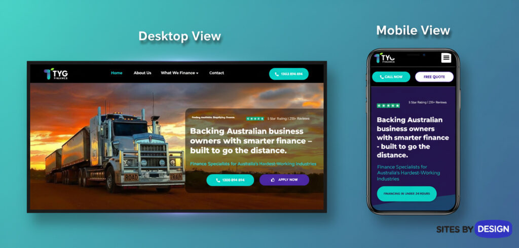
Sites By Design’s own builds use this configuration by default because it’s the most sustainable way to handle mobile SEO. A single responsive layout means you’re future-proofed for new screen types – whether that’s foldable phones or tablets with larger displays.
Dynamic Serving and Separate URLs
Some older or highly customised sites still use dynamic serving or separate mobile URLs. Dynamic serving keeps one URL but delivers different HTML based on the visitor’s device. For this to work properly, Google stresses the importance of the Vary: User-Agent HTTP header, which signals that the content changes depending on who’s viewing it.
Then there’s the “m-dot” approach – separate URLs like m.example.com. Google warns this configuration “serves different HTML to each device and on separate URLs” and must be carefully managed to avoid indexation errors.
When using separate URLs, the relationship between versions must be explicit:
- The desktop page should include <link rel=”alternate”> pointing to the mobile version.
- The mobile page should point back with <link rel=”canonical”>.
Without these, Google might index the wrong version – or none at all.
For most Sydney SMEs, responsive design remains the right call. It’s simpler, cleaner and in line with what Google’s mobile-first systems are built to understand. If you’re redesigning your site in 2025, we urge you to choose responsive design from the start – it’s faster to maintain, cheaper to optimise and far more reliable for ranking performance.
Google officially recommends responsive design for mobile SEO because it uses one URL, one HTML version and one smooth experience across all screens – no redirects, no confusion. Learn more about mobile-friendly website design.
Optimising Mobile User Experience
A high-ranking site might still fail if it’s frustrating to use. This comes down to mobile user experience (UX) – the bridge between visibility and conversion. Google’s algorithms increasingly factor usability into rankings and the difference between a tap and a bounce can come down to milliseconds.
Improve Page Speed and Core Web Vitals
Speed is the single biggest driver of mobile performance. Google Search Central advises:
“Make sure that Google can access and render your mobile page content and resources.”
This includes scripts, images and stylesheets that shape how your site loads. Blocking any of these in your robots.txt file can slow down rendering and hurt visibility.
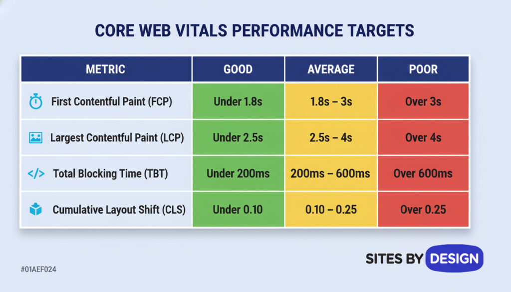
For SEO and conversion, aim to meet these Core Web Vitals benchmarks:
- Largest Contentful Paint (LCP): under 2.5 seconds
- Interaction to Next Paint (INP): under 200ms
- Cumulative Layout Shift (CLS): below 0.1
Use tools like PageSpeed Insights, GT Metrix and Lighthouse to audit real-world speed. For Sydney businesses hosting locally, Sites By Design’s high-performance servers and hosting service provide an edge by reducing latency – crucial when most of your customers are accessing your site on mobile data rather than Wi-Fi.
Simplify Navigation and Tap Targets
You’ve probably experienced this: you’re on your phone, trying to tap a small button and accidentally hit the wrong link. Tiny touch targets are one of the fastest ways to frustrate mobile users.
Google’s Material Design framework recommends a minimum size of 48×48 pixels, with at least 8px spacing between elements. Apple suggests a similar 44×44 guideline.
Menus should collapse cleanly, calls-to-action should be “thumb-friendly,” and critical navigation, like your phone number or quote button, should appear in the top viewport.
A responsive Sydney tradie site, for instance, might place a “Call Now” button fixed at the bottom of the screen so users can reach it instantly, no matter how far they scroll.
Readable Fonts and Scannable Layouts
Mobile screens are small, so text readability can make or break engagement. A rule of thumb:
- Font size: at least 16px for body copy.
- Line height: 1.5–1.6× the font size for comfortable reading.
- Contrast: dark text on a light background for clarity outdoors.
Short paragraphs (two to three sentences) and clear subheadings help readers scan quickly. Additionally, add generous white space and bullet lists sparingly.
For inspiration, review Sites By Design’s client success stories and Web Design Services – every site we craft prioritises scannability and clarity across devices.
Mobile-friendly design means fast loading, tappable buttons and readable text. The easier your page feels to use on a phone, the better it performs in Google’s search results and the more it converts traffic into paying customers. Discover more website lead generation strategies.
Mobile Technical SEO Best Practices
Your site’s technical foundation determines how well Google understands it. These behind-the-scenes optimisations are what allow great design to translate into lasting rankings.
Keep Metadata Consistent Across Devices
Google stresses: “Make sure that the title element and meta description are equivalent across both versions of your site.”
This avoids mismatched data that could confuse the mobile-first index. The same goes for robots meta tags – never set noindex or nofollow on your mobile pages unless you intend to remove them entirely from search.
If your desktop site includes schema or structured snippets, replicate them exactly on the mobile version. Inconsistent metadata can result in lower rankings or missing rich results.
Implement Structured Data and Schema Markup
Structured data helps Google understand your page content and display enhanced listings, especially valuable on small mobile screens where space is limited.
Google’s official advice:
“Make sure that your mobile and desktop sites have the same structured data. If you have to prioritise which types to add, start with Breadcrumb, Product and VideoObject structured data.”
For local Sydney businesses, also include LocalBusiness schema 2 to support “near me” searches. Make sure the URLs within the schema match your live mobile URLs exactly.
Avoid Blocking JavaScript and CSS
Modern websites rely heavily on JavaScript and CSS for layout and functionality. If these files are blocked, Google can’t properly render your site.
“Let Google crawl your resources. Some resources have different URLs on the mobile site from those on the desktop site. If you want Google to crawl your URLs, make sure that you’re not blocking the URL with the disallow rule.”
In short: open up your resources. Ensure both your desktop and mobile robots.txt files allow Google to crawl everything necessary to display your page accurately.
Optimise Images and Videos for Mobile
Visual content remains key, but it must load efficiently and retain quality. Google recommends:
“Provide high-quality images. Don’t use images that are too small or have a low resolution on the mobile site.”
Maintain the same alt text, file names and structured data for both versions. This not only helps accessibility but ensures your visual assets continue ranking in image and video search.
For embedded videos, use supported tags like <video> or <embed> and position them “in an easy-to-find location on the page when viewed on a mobile device.” Videos that require excessive scrolling can harm ranking and engagement.
Technical mobile SEO is about clarity and accessibility. When Google can fully see and render your site – scripts, images, data and all – it rewards you with stable, lasting visibility.
Local SEO for Mobile Users in Sydney
Mobile search and local SEO are inseparable. When someone in Sydney types, or speaks, “best accountant near me” or “plumber in Sutherland Shire,” Google instantly factors in their location, search intent and the usability of your mobile site. According to Google Search Central, a truly mobile-friendly website must not only load fast but also present consistent, accessible content that Google can index easily.
That consistency is critical for local visibility, as it improves your EEAT Signals which partly includes your website’s technical signals (speed, crawlability, schema) with your business presence on Google Maps, reviews and structured listings.
Why Local Mobile Searches Matter
The dominance of mobile in local discovery can’t be overstated. Global studies show that 46% of all Google searches are local and nearly 80% of those local searches happen on mobile devices. In Sydney, this behaviour is even stronger because of how people move through the city – commuting, comparing and deciding while they’re out.
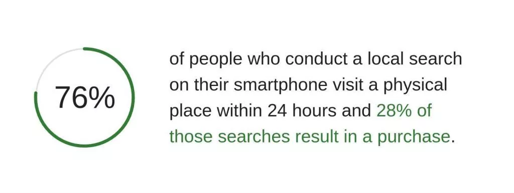
When your site is properly optimised for mobile, your business is more likely to appear in Google’s Map Pack and “near me” results, where most local decisions happen. Google’s own research notes that users who find a business through a mobile search are “significantly more likely to visit or make contact within a day.”
For Sydney businesses, this means a fast mobile experience directly translates into foot traffic and phone calls. A family lawyer in Newtown, for instance, benefits when their mobile site loads within two seconds, displays up-to-date opening hours and integrates reviews – because those signals align with what Google prioritises for on-the-go users.
In Sydney, mobile searches like “near me” aren’t casual browsing – they’re buying intent. Fast, consistent mobile pages turn those searches into visits and calls.
Optimising Your Google Business Profile for Mobile SEO
Your Google Business Profile (GBP) is one of the most powerful mobile SEO tools available. It determines whether your business shows up in Google Maps, voice searches and “near me” results.
To optimise effectively:
- Ensure your Name, Address and Phone number (NAP) are identical across your site, your GBP and any directories.
- Add high-quality photos that represent your services or venue.
- Keep opening hours and service areas current.
- Encourage customer reviews and respond promptly – Google treats active engagement as a freshness signal.
Sydney-based businesses should also include suburb names in their service descriptions and posts. For example, “emergency plumbing in Cronulla and Miranda” or “SEO agency serving Sydney CBD and Sutherland Shire.” This helps your mobile presence align with local search intent.
A properly maintained GBP boosts mobile discovery even when users never reach your website, giving you visibility in the zero-click space that dominates mobile SERPs.
Location Keywords and Schema
Location-based keywords remain essential, but the smarter approach in 2025 is to blend them naturally into your site’s metadata and structured data.
Google advises maintaining the same structured data across mobile and desktop. For local SEO, that means implementing LocalBusiness schema 2 with fields for:
- @type (e.g. Electrician, Café, Consultant)
- address including city and postcode
- openingHours
- telephone
- geo coordinates
When formatted correctly, this data helps Google confirm that your Sydney business serves the local area it claims to, improving map visibility.
It’s also wise to optimise mobile page titles and meta descriptions to reflect location:
- “Affordable Plumbing Repairs Sydney | 24/7 Mobile Service”
- “SEO Agency Sutherland Shire | Mobile-Friendly Web Design Experts”
These micro-optimisations make a measurable difference in mobile-first indexing, ensuring your content surfaces for relevant location-specific searches.
Advanced Mobile SEO Strategies
Once you’ve nailed the basics, advanced strategies can push your mobile performance from “visible” to “dominant.” These focus on voice search, analytics tracking and user experience testing.
Optimising for Voice Search
Voice searches are now a major slice of mobile traffic. According to research (2025), more than 30% of all searches are voice-based and rising steadily. This changes how we think about keywords.

Typed queries tend to be short and functional (“SEO Sydney”), while spoken ones sound conversational (“Who’s the best SEO agency in Sydney?”). The trick is to design your content to answer questions naturally.
Start with FAQ-style headings – for example:
- “What is mobile-first indexing?”
- “How does mobile SEO affect Sydney businesses?”
Then provide clear, direct answers in under 80 words, followed by expanded context. This structure not only serves voice assistants like Google Assistant but also improves your chances of winning featured snippets and appearing in answer engine generated responses on ChatGPT, Perplexity and other AI models.
Think of voice SEO as conversational SEO. When your content sounds like a helpful answer, not a list of keywords, Google’s voice algorithms reward it with visibility.
Monitoring Mobile Keyword Rankings
Once your mobile SEO is in motion, tracking its performance separately from desktop is vital. Tools like Semrush, Ahrefs, Google Analytics 4 and Google Search Console allow you to filter rankings by device. Not sure which tool to choose between Semrush and Ahrefs? Here is how they compare.
By comparing mobile and desktop positions, you can uncover hidden insights – like pages that rank well on desktop but drop on mobile due to slower speed or missing elements.
For example, a Sydney florist might rank top-3 for “wedding bouquets Sydney” on desktop but fall to page two on mobile because of oversized images or scripts. Fixing those issues can quickly restore performance.
Comparing Mobile vs Desktop Performance
Google Analytics offers a clear window into how users behave across devices.
Under Reports → Acquisition → Traffic Acquisition, you can compare mobile versus desktop sessions. Watch for patterns:
- If bounce rates are higher on mobile, your UX or speed may need work.
- If conversion rates drop, your calls-to-action might not be mobile-friendly.
Sydney’s mobile users are fast decision-makers – they expect tappable phone numbers, one-click booking forms and visible pricing. Use this behavioural data to refine your layout and flow.
Testing with Lighthouse and PageSpeed Insights
Google Search Central specifically recommends testing with Lighthouse and PageSpeed Insights, as these tools simulate mobile conditions accurately. They audit for accessibility, SEO and performance, including how your site behaves on slower 3G connections.
Google’s guidance:
“Use the URL Inspection tool to check that the content is visible on the rendered page (the rendered page is how Google sees your page).”
These tools highlight problems and also provide actionable steps – like compressing images, reducing render-blocking resources, or improving Core Web Vitals.
Sydney businesses that consistently review these scores can maintain high-speed performance even as design trends evolve.
Common Mobile SEO Mistakes to Avoid
Even the best-intentioned sites can lose ground when small technical oversights slip through. Google’s documentation lists frequent issues that can block mobile-first indexing or lead to ranking drops.
1. Missing or Mismatched Structured Data
If your mobile site lacks the structured data your desktop site has, Google can’t understand your content fully.
“Verify that the structured data is present on both versions of your site,” Google advises.
Keep schema consistent, with URLs properly formatted and linked.
2. “noindex” or “nofollow” Tags on Mobile
A common mistake is leaving noindex or nofollow directives on mobile pages after development.
“Don’t use the noindex tag on the mobile page – otherwise, Google won’t index your page when your site is enabled for mobile-first indexing.”
Always double-check that both versions share the same robots meta settings.
3. Low-Quality or Missing Images
“Provide high-quality images. Don’t use images that are too small or have a low resolution on the mobile site.”
Avoid changing image URLs between versions. If you must, expect a temporary drop in image traffic until Google reindexes.
4. Blocked JavaScript, CSS, or Media Files
Ensure your robots.txt file doesn’t block critical assets. Google needs full rendering access to understand layout and interactivity.
5. Inconsistent Page Titles or Meta Descriptions
Missing meta information can cause mobile pages to underperform.
“Make sure that the titles and meta descriptions are equivalent across both versions of your site.”
6. Lazy Loading Errors
Google warns:
“Don’t lazy-load primary content upon user interaction. Google won’t load content that requires swiping, clicking, or typing.”
Always ensure essential text and visuals load immediately, without needing a tap or scroll to appear.
The smallest mobile SEO mistakes – like missing meta tags or lazy-loaded text – can make your site invisible in Google’s mobile-first index. Audit regularly, test often and fix fast. Learn more about common SEO mistakes most Sydney businesses make and how to avoid them.
How Sites By Design Helps Sydney Businesses Optimise for Mobile
Mobile SEO isn’t just a checklist – it’s an ecosystem of design, development and data working together. For Sydney businesses, that ecosystem needs to perform under real-world conditions: people searching during peak-hour traffic, comparing quotes while waiting for coffee, or scanning reviews on a job site. That’s where Sites By Design brings everything together.
Our team has been building mobile-first, high-performance websites for over 15 years, aligning design precision with SEO strategy and Google’s technical standards. We don’t treat mobile optimisation as an afterthought; it’s built into every design decision from the first sketch. Every new site we deliver uses responsive design, ensuring the same HTML, structured data and metadata across all devices – exactly as Google Search Central recommends.
“Google recommends Responsive Web Design because it’s the easiest design pattern to implement and maintain.” – Google Search Central, Mobile-First Indexing Best Practices
This consistency allows Google’s crawler to index your content seamlessly and ensures your customers see a unified, polished experience whether they’re on a laptop or an iPhone.
Performance Meets Local Expertise
Being a Sydney-based agency gives us a unique understanding of what local users expect. We design for real Australian usage – mobile data speeds, device preferences and the habits of people who search “near me” every day. Our hosting infrastructure is Aussie-owned and operated, optimised for speed and uptime and tested against Core Web Vitals benchmarks so your mobile pages load fast even on 4G connections.
This local-first approach isn’t just about compliance with Google’s standards – it’s about conversion. Industry studies from Think with Google shows that sites meeting the one-second load threshold achieve conversion rates siginicantly higher than those taking five seconds. For a Sydney business that depends on local enquiries, that difference can mean hundreds of new leads a year.
We audit every website with PageSpeed Insights, GT Metrix and Lighthouse, fixing any issues with CSS, JavaScript, or media rendering that could hurt mobile performance. Structured data is validated with Google’s Rich Results Test, ensuring mobile users see your ratings, business details and product highlights right in the search results.
Sites By Design builds every website to meet Google’s mobile-first standards – fast, responsive, consistent and designed to turn Sydney searchers into customers.
Integration Across SEO and Google Ads
Mobile SEO doesn’t exist in isolation. It works hand in hand with your other digital marketing efforts (Google Ads and Meta Ads), local SEO and analytics. That’s why our campaigns are built to complement mobile-first experiences.
A fast-loading site amplifies your ad performance because Google Ads also measures landing page experience. When mobile visitors click an ad and the page loads instantly, your Quality Score improves – reducing your cost per click and boosting visibility.
By connecting mobile analytics and conversion tracking, we identify exactly where users drop off or engage most. This lets us refine every touchpoint, from ad copy to contact forms, so that your mobile visitors become paying customers.
Every Sydney client we work with gains access to measurable improvements in both speed and SEO ranking within the first few months of optimization and in some cases just a few weeks. Whether it’s a trades business, professional service, or startup, we ensure every mobile experience reinforces your brand’s credibility and delivers a measurable return.
Sydney Case Example: SealRite Solutions – Mobile SEO That Delivers Real Local Results
When SealRite Solutions, a Sydney waterproofing specialist, partnered with Sites By Design, they were already delivering quality work but weren’t appearing prominently in local search results. Their existing website wasn’t fully aligned with Google’s mobile-first indexing standards – it lacked dedicated location pages, had uneven meta data and wasn’t making the most of structured local signals that drive “near me” visibility.
We refined the website with a fully responsive design, ensuring it rendered perfectly across all devices. Our team rewrote and optimised key service pages, including leaking shower repairs and leaking balcony repairs, to align with local search intent. We also added targeted location pages for the Eastern Suburbs and surrounding Sydney areas, improved on-page meta data, and implemented LocalBusiness schema to reinforce their credibility in Google’s index.
Within weeks, the results were clear: SealRite Solutions now consistently appears in the Google Map Pack and ranks within the top three to five organic results for their primary service-related searches across Sydney and the Eastern Suburbs. This visibility surge has translated into a significant increase in enquiries, phone calls, bookings, and sales and optimisation work is ongoing as we continue to refine their site performance and local content.
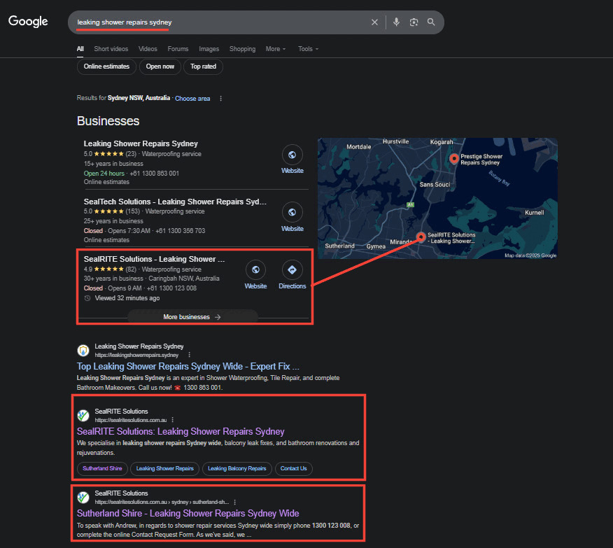
These outcomes highlight what happens when technical precision meets local expertise. By aligning mobile SEO, site architecture, and content with Google’s mobile-first framework, we helped a Sydney business dominate its local market and attract ready-to-book customers.
Through responsive design, structured data, and locally focused content, Sites By Design helped SealRite Solutions secure top Map Pack positions and surge in mobile leads across Sydney’s Eastern Suburbs.
Your Customers Are Searching on Mobile – Will They Find You?
The internet has officially gone mobile-first. For Sydney businesses, that reality isn’t just about keeping up – it’s about standing out. Mobile SEO determines how easily people can find you, how confidently they can navigate your site and how quickly they can act once they’re there.
Google’s best practices make one thing crystal clear: a successful website must offer the same content, structure and quality across all devices. Mobile isn’t a simplified version of your business; it is your business in the eyes of both search engines and customers.
If your site loads slowly, hides content, or isn’t designed responsively, you’re leaving money on the table every single day. The solution is straightforward: align your web design, hosting and SEO strategy with Google’s mobile-first framework – and watch your visibility rise.
Mobile SEO isn’t just a ranking factor anymore. For Sydney businesses, it’s the bridge between being found and being forgotten.
If you’re ready to see how your site performs on mobile, we’ll show you where you stand – and where you could be.
Book your free SEO audit with Sites By Design
FAQs: Mobile SEO and Mobile-First Indexing
What is mobile-first indexing and why does it matter for Sydney businesses?
Mobile-first indexing means Google primarily uses the mobile version of your site for indexing and ranking. Google explains that it “uses the mobile version of a site’s content, crawled with the smartphone agent, for indexing and ranking.” For Sydney businesses, that means the content, structured data and metadata on your mobile pages must match desktop. If your mobile version is thin or slow, your visibility across all devices will drop.
How fast should a mobile site load to perform well on Google?
Aim for a visually complete page within about two seconds and pass Core Web Vitals. As practical targets, keep Largest Contentful Paint under 2.5 seconds, Interaction to Next Paint under 200 ms and Cumulative Layout Shift below 0.1. Faster pages earn higher engagement, lower bounce rates and a better shot at top positions in mobile results.
Is responsive design really better than separate mobile URLs?
Yes, for most sites. Google states, “Google recommends Responsive Web Design because it’s the easiest design pattern to implement and maintain.” Responsive design serves the same HTML on one URL, so sharing, crawling and indexing are simpler. Separate m-dot URLs and dynamic serving can work, but they add complexity with canonical/alternate tags, Vary headers and higher risk of mismatches.
What tools can I use to test my mobile SEO performance?
Use PageSpeed Insights, GT Metrix and Lighthouse to measure Core Web Vitals and diagnose speed and UX issues. In Search Console, rely on the URL Inspection tool to see the rendered mobile page and the Mobile Usability report to catch layout or tap-target problems. Combine these with real-device checks to confirm forms, menus and CTAs work smoothly on common phones.
Does mobile SEO help with voice and “near me” searches?
Absolutely. A fast, well-structured mobile site improves your chances of appearing in local Map Pack results and featured answers in AI models. Voice queries are conversational, so clear Q&A headings and concise answers help assistants pull your content. Pair that with an optimised Google Business Profile and consistent NAP details to capture “near me” intent from on-the-go Sydney users.
How do you optimise for mobile SEO?
Start by ensuring your website uses responsive design, meaning it automatically adapts to any screen size. Then, optimise for speed – compress images, enable browser caching and minimise scripts. Finally, validate your mobile performance using Google’s PageSpeed Insights and Lighthouse tools.
How do you approach SEO for mobile devices and optimise for mobile-first indexing?
Follow Google’s official guidance for mobile-first indexing: keep identical content, structured data and metadata across desktop and mobile versions. Ensure your mobile site isn’t blocking resources like CSS or JavaScript and verify it in Search Console using the smartphone crawler.
How to make a website mobile optimised?
Adopt responsive web design, simplify navigation, use larger tap targets and shorten forms. Google adds: “Create a mobile-friendly website so your users visiting your site through a mobile phone can have a stellar experience.”
Does SEO work on mobile?
Absolutely. SEO drives discovery across all devices, but mobile-first indexing means your mobile site directly determines your overall ranking. If your mobile experience is poor, even your desktop visibility will suffer.
Which factor is crucial for mobile SEO?
Page speed and consistent content. As Google explains, “Only the content shown on the mobile site is used for indexing.” A slow or incomplete mobile page can erase your rankings entirely.
What is the RankBrain algorithm?
RankBrain is Google’s AI-based system that interprets search intent and context. On mobile, it helps Google connect conversational or voice-based queries to relevant results – rewarding clear, well-structured content.
How to improve website performance on mobile?
Audit your Core Web Vitals, reduce server response times and serve optimised images. Sydney businesses hosting locally, such as through Sites By Design’s Aussie-owned and operated hosted service, see faster delivery and better mobile scores.
How to check if a website is mobile optimised?
Use Search Console’s Mobile Usability report and insights from Google’s PageSpeed Insights and Lighthouse tools. These tools identify any layout, font, or content issues affecting mobile users.
What is Google’s Accelerated Mobile Pages (AMP)?
Accelerated Mobile Pages (AMP) is an open source initiative and framework designed to make mobile pages load almost instantly by simplifying code and caching content. Although it’s no longer required for visibility or a direct ranking factor, it is still useful since it improves mobile page speed and friendliness which can grow your rankings.
Is Google AMP discontinued?
No, Google AMP is not officially discontinued. However, Google has removed the primary incentives for AMP – such as the AMP badge and the requirement for AMP in the Top Stories carousel. Additionally, AMP is no longer necessary for SEO or featured placements and Google’s focus has shifted to Core Web Vitals and broader mobile optimisation.
What is lazy loading?
Lazy loading delays the loading of images or videos until they’re needed. However, as Google cautions, “Don’t lazy-load primary content upon user interaction” – critical text and visuals must load immediately for indexing.